Combining the Best of Both Worlds.
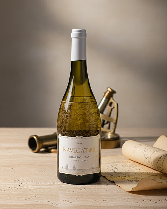
Navigator Chardonnay is guided by a sense of place — Napa Valley expressed through precision, balance, and restraint. Rooted in classic winemaking and inspired by exploration, the wine carries a quiet confidence shaped by coastal influence, careful farming, and thoughtful blending.
That sense of intention extends directly onto the bottle.
Navigator’s label design brings together two distinct printing techniques working in harmony. A detailed map illustration is screen-printed directly onto the glass surface. Layered over it, a paper label provides contrast and structure, grounding the design with clarity and tradition.
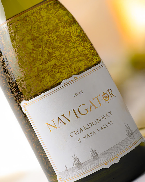
The result is dimensional without being loud. Light filters through the Chardonnay and the screen-printed map, creating depth and subtle movement, while the paper label grounds the design with tradition and a sense of familiarity. It’s a thoughtful balance of permanence and refinement — modern technique paired with classic presentation.
At Monvera, we help wine brands like Navigator combine materials and methods intentionally — using the right printing approach in the right place to tell a richer story through the bottle itself.
Launching a new wine or brand? Contact us here.