Growing your winery’s online presence is essential, but increasing website traffic can be costly – especially when it comes to paid advertising. Since you can’t control the cost of acquiring new visitors, the best way to maximize your marketing budget is by improving your conversion rates, average order values, and long-term customer retention.
One powerful tool to help with this? Heatmaps. 🔥

Really – this data doesn’t lie. Heatmaps give you visual insights into how visitors interact with your website, showing where they click, scroll, and spend the most time. With these insights, you can refine your website’s layout to better engage potential customers, drive more wine club sign-ups, and increase online sales.
Discover three ways wineries can use heatmaps to optimize conversions. 🤘
1) Uncover “Dead Zones” & Boost Engagement
Heatmaps reveal what your visitors focus on – and what they ignore. Take a look at the example below:
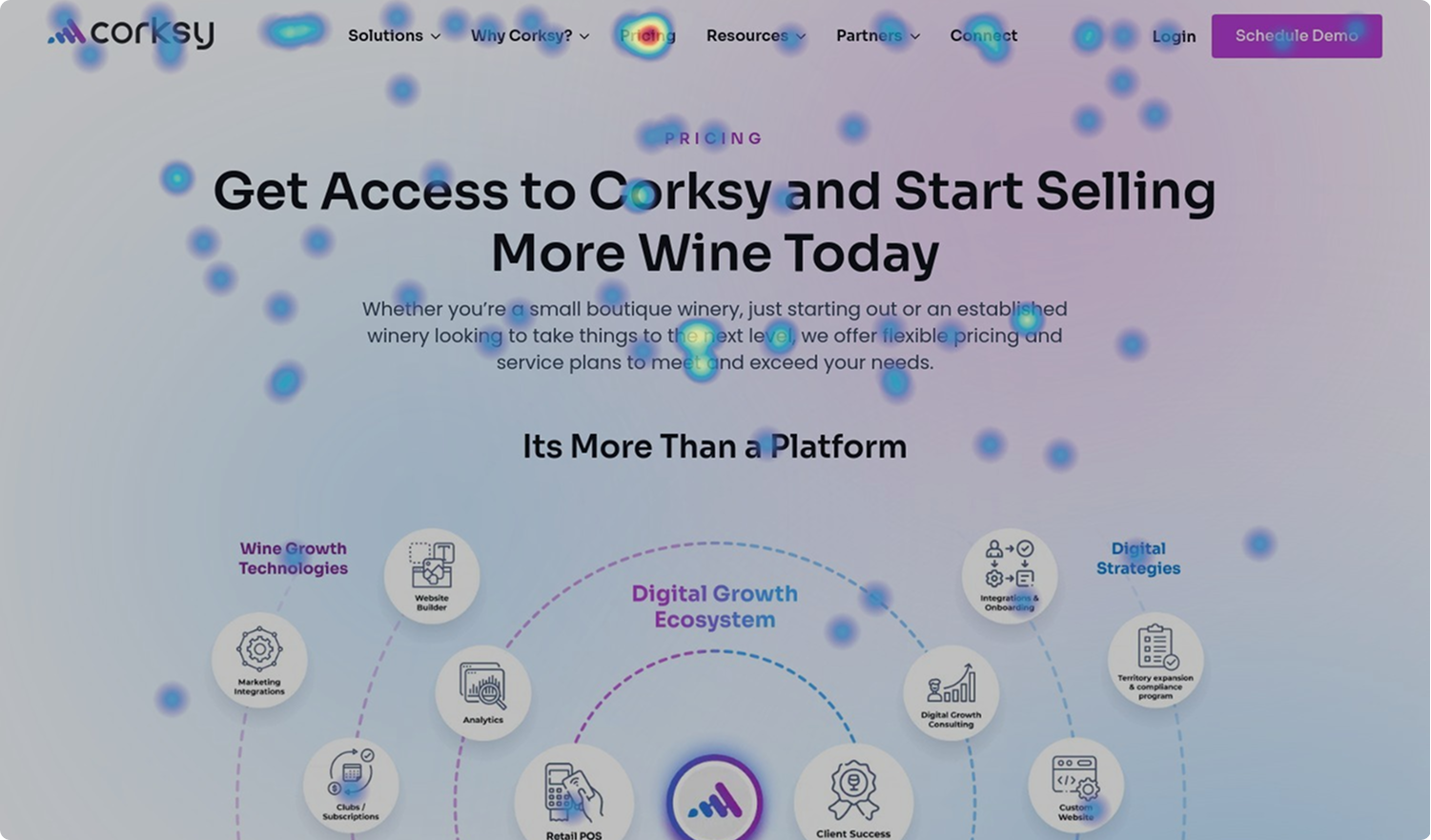
When reviewing a heatmap, look for:
- Hot spots (red, orange, yellow areas): These indicate high engagement, such as frequent clicks or cursor movement.
- Cool spots (blue or no color): These are “dead zones” where visitors aren’t interacting.
By identifying these patterns, you can see whether visitors are focusing on the right elements or if important sections are being overlooked.
💡 How Wineries Can Apply This Data
Once you’ve analyzed your heatmap, use these insights to optimize your site:
- CTA Placement: If your “Join the Wine Club” or “Shop Now” button is in a low-engagement area, test moving it to a hot spot where users are already paying attention.
- Homepage Adjustments: If visitors are ignoring your featured wine section, you might need more engaging imagery, pricing visibility, or clearer descriptions.
- Tasting Room Bookings: If your “Visit Us” page gets clicks, but the booking button is in a dead zone, try moving it higher on the page or closer to the sections with high activity.
- Navigation Issues: If visitors aren’t clicking key menu links, your navigation might be too complex or missing what they’re looking for – consider renaming menu items or repositioning them.
By continuously testing and adjusting based on heatmap insights, wineries can improve their website experience, leading to higher wine club sign-ups, more tasting room bookings, and increased online sales.
2) Adjust Layout Using Scroll Depth
Not all visitors scroll to the bottom of your page. Scroll depth heatmaps show where most users stop reading, helping you optimize content placement.
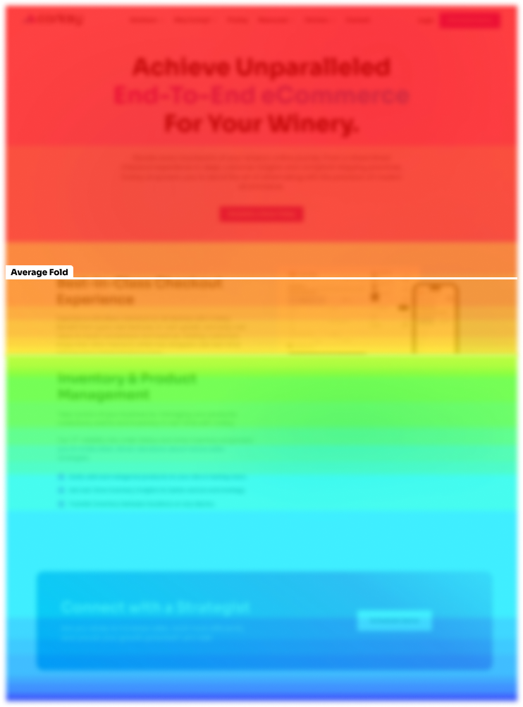
❓What Is the Average Fold?
The average fold refers to the point on a webpage that is visible without scrolling when a visitor first lands on the site. Anything below this point requires the user to scroll to see it. Since different devices and screen sizes have varying fold placements, heatmaps help determine where most users stop scrolling and what content they actually see.
For example, if your wine club benefits or special promotions are placed far below the average fold and most visitors don’t scroll that far, they might never even see those offers.
💡 Applying These Insights
If customers aren’t scrolling far enough to see your limited-time wine bundle or special offer, you might:
- Move key promotions higher on the page so they are visible above the fold for most visitors.
- Add a call-to-action (CTA) that scrolls users down to important sections, like membership details or seasonal discounts.
- Use subtle cues like an arrow icon or “Swipe to Learn More” text to encourage scrolling.
For instance, if visitors stop reading just before your wine club benefits are listed, shifting that section higher could lead to more sign-ups.
By analyzing scroll depth and the average fold, wineries can ensure that high-value content is seen by more visitors, leading to better engagement and higher conversions.
3) Experiment with Calls-to-Action (CTAs)
Once you’ve identified the best places for your CTAs, test different variations to see what resonates with visitors.
- Try different CTA placements – such as adding “Join the Club” buttons near highly viewed sections.
- Test multiple CTA copy versions – for example, instead of “Subscribe to Our Newsletter,” try “Get Exclusive Wine Offers.”
- Consider using contrast and design elements to make buttons stand out more (we go over all things design elements in our on-demand Website Design 101 webinar)!
With Corksy’s website builder, wineries can easily test different CTA placements, colors, and copy – no developer needed. Ongoing testing and optimization help fine-tune your website, turning more visitors into loyal customers.
Time to Turn Up the 🔥

The cost of acquiring customers online isn’t likely to decrease, so making the most of your existing traffic is crucial. Heatmaps provide valuable data to refine your website layout, improve conversions, and increase sales – without spending more on ads.
And remember: Higher conversions alone aren’t the goal. Keep an eye on average order value and customer lifetime value to ensure your optimizations are driving sustainable revenue for your winery.
Want expert guidance on analyzing and optimizing your winery’s website? Let’s chat.